Jeff
Pelletier
Work
A sampling of work I've contributed to in recent years.
BILL Design Systems. Project: Design Tokens
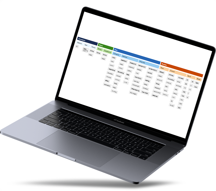
I owned design tokens end-to-end at BILL, from initial taxonomy and naming to automation via "token services", implementation in design systems components as CSS custom properties and documenting in the design systems docs site.
The naming disussions resulted in a taxonomy that was published to the docs site, and made naming tokens in the future much more fluid.
I worked with the Tokens Studio plugin to wire up tokens in Figma with a design token translation tool (Style Dictionary) in code.
The results included the first time design token changes were visible (via source control), the ability for designers to work on tokens and have their work reflected in code, and a section of our docs site that was usable by design and engineering audiences alike.
Oh, and my arm was re-Tweeted by the w3c Design Tokens Community Group.
BILL Design Systems. Project: Theming
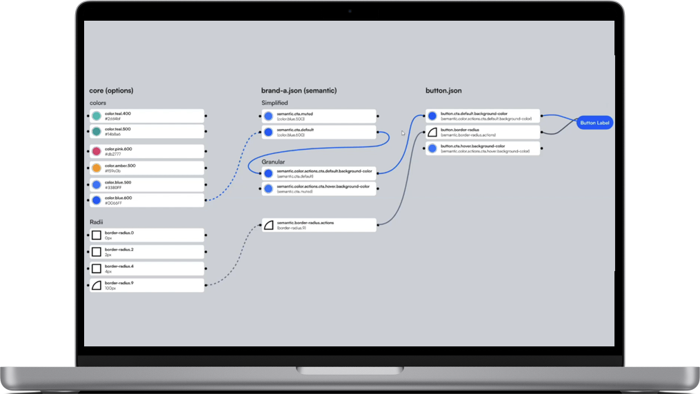
The BILL design system required theming from multiple perspectives: both for 13 bank partners as well as multiple acquired products.
I solved this challenge with an additional layer of design tokens: component tokens. This allowed the team to tweak specific design elements (like border-radius on buttons) per bank partner or product (without unintentionally impacting other components using similar semantic layer tokens).
Bank partners primarily reserved theming requests to color and font, while for the product efforts, tokens like space, border-radius and more complex changes like layout and positioning were required.
The result was a single Lit component codebase being able to support multiple bank channels and BILL products, all via a single toggle in Storybook or product. During one redesign, engineering remarked that "Jeff’s theming work enabled 50% of the color and typography updates via the flip of a switch, allowing engineering to focus on the remaining updates".
Further research on component tokens.
BILL Design Systems. Project: Feature Workflow
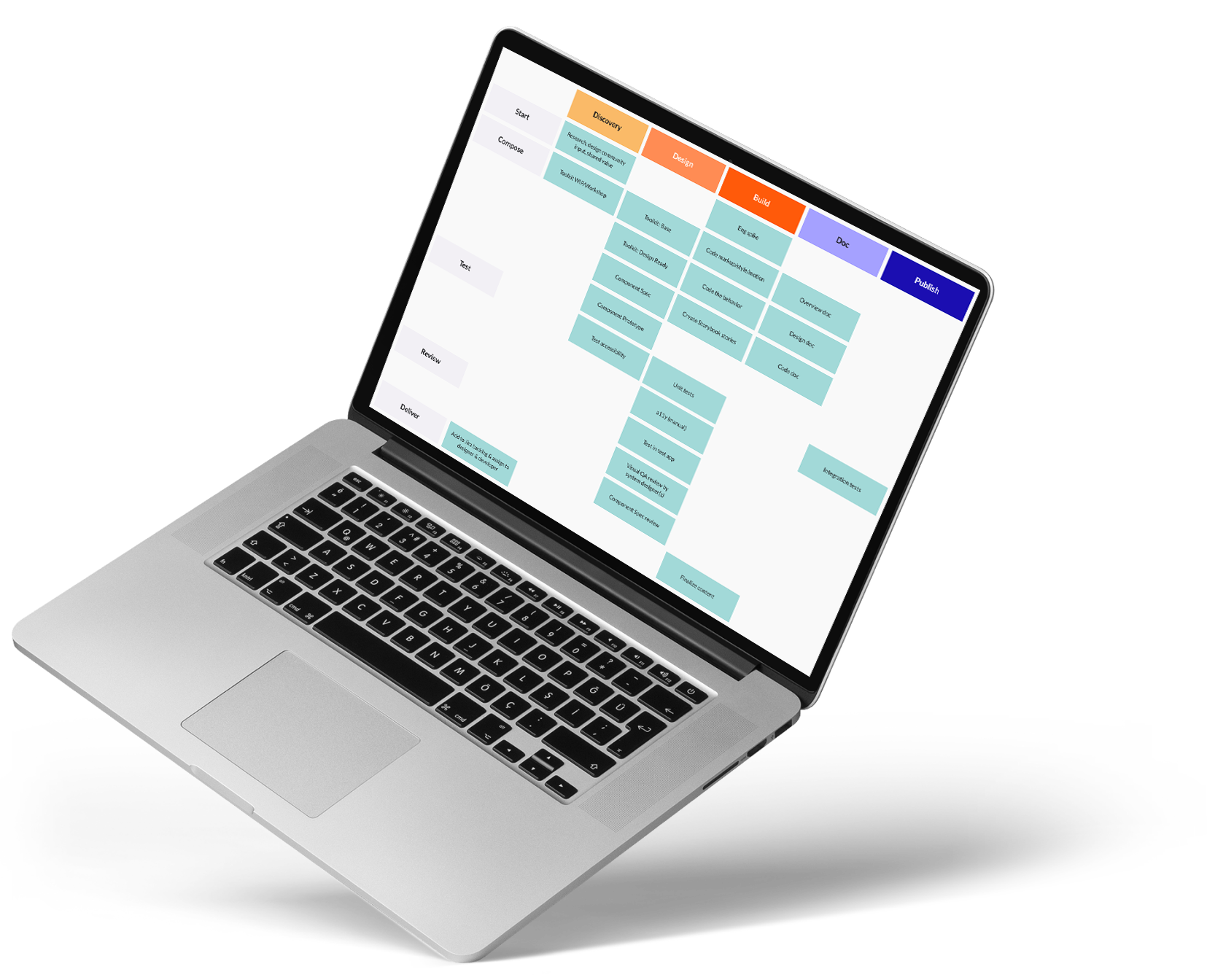
I ran a multi-session workshop with the BILL design system team to inclusively determine what the team collectively defined as the steps and sub-steps to be completed for any design system feature work.
I drafted a workshop blueprint, ran the workshop in FigJam, documented the decisions in the docs site, and reflected the decisions as cloneable epics and tickets in Jira.
The result was a consistent definition of done across design and engineering, with visuals that paired with color-coded Jira tickets, which the team responded to with extremely positive feedback at retros.
Further research on design systems feature workflow process.
BILL Design Systems. Project: Component Specs
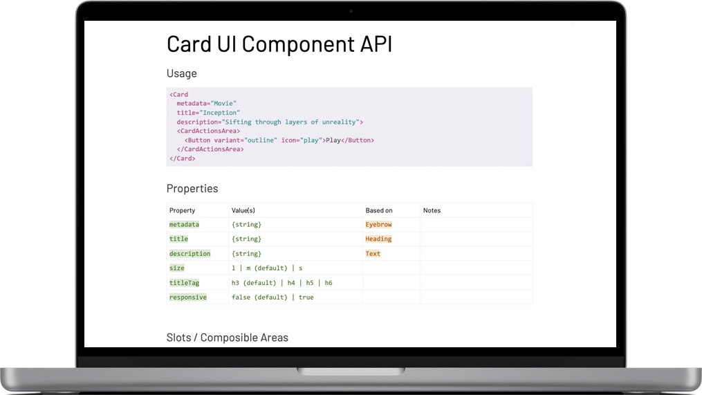
I developed a Google Doc template that was leveraged to implement over 50 component specs, detailing component API (props, slots, etc.) and other component handoff details like behavior, animation, accessibility and responsive requirements.
These docs served as a communal location for design and engineering to work together while designing and building components, as well as a record of what the requirements were at any given point in history.
The result was overwhelmingly positive from the team: increased collaboration across design and engineering, and more robust and refined API details and component quality in general.
Further research on component specs for design systems.
BILL Design Systems. Project: Metrics
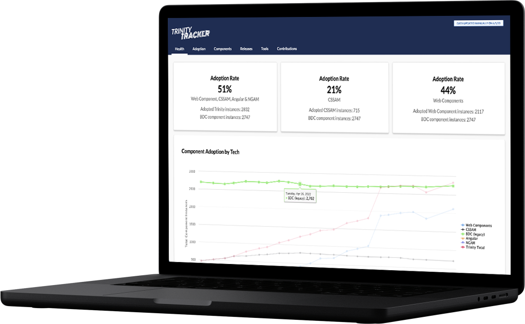
As part of a week long hackathon, I built a tool using Node.JS that searched product codebases at BILL for instances of components. Additionally, I built the frontend UI for a website to make the data generated by the componeent finder tool visible to the company.
I ran the tool monthly, and published a report in Slack driving people to the frontend UI. The result was being able to visibly see over time when the components from the design system actually eclipsed the quantity of legacy components in product.
I also looked at assigning monetary value to the design system team's work, in the form of interviewing product designers and engineers, and translating that into a number based on the quantity of components currently adopted by product.
These reports fed up to leadership as well as made use of by PM's looking to understand where to prioritize.
BILL Design Systems. Project: Advocacy

I hosted a series of 6 watch parties where everyone in the company was invited to watch a single video on design systems, and then participate in dicsussion for the remainder of the hour.
The video series chosen was the excellent design system series produced by InVision featuring Brad Frost, Dan Mall and Josh Clark.
The goal with this series was to uplevel the design systems knowledge across the company in a casual forum where everyone felt comfortable asking questions and participating in the discussion.
Client: Great Minds. Project: greatminds.org
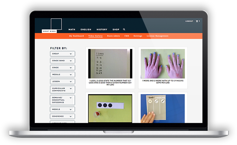
Great Minds was a responsive redesign, from the ground up. I was brought on to the project after the initial groundwork had been laid, so I was able to focus on all the responsive aspects of the project. Bootstrap was used, so my work involved heavy customization of Bootstrap and CSS overrides to achieve the client's desired intent. I also focused on frontend performance, primarily addressing the large background images and serving the proper size image to users based on Tim Kadlec's research.
I additionally developed a living style guide for Great Minds using KSS, which updates based on CSS changes in the product.
Check out the case study.
Client: Message Systems. Project: SparkPost
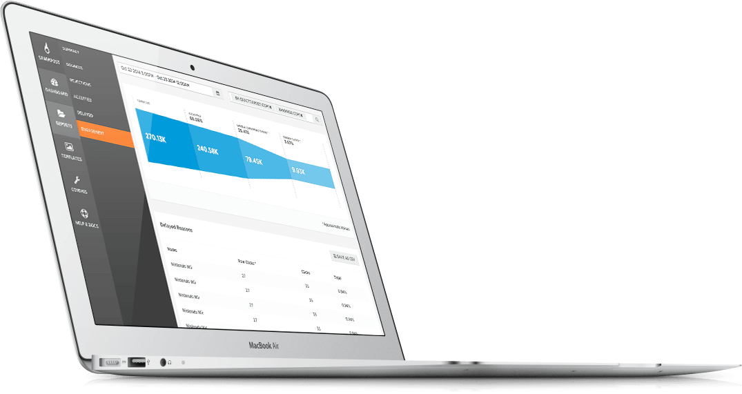
SparkPost is a competitor to MailChimp's Mandrill transactional email service. I built the UI pieces of the product, the most complex being the responsive nav. Cards, buttons, tables and charts were just some of the components that were part of this data-heavy web app.
I also built living style guide for this project, but unfortunately the work isn't public without signing up. You can check out the case study for more details, however.
Client: National University System. Project: Sanford Harmony SEL
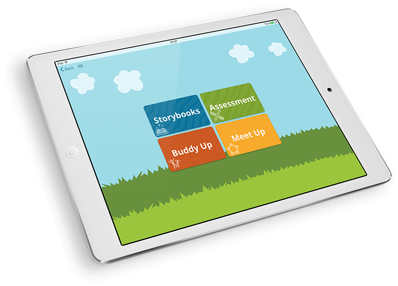
The Sanford Harmony SEL (social emotional learning) tablet app was a unique problem to solve: the client is using this application in classrooms, and needed it to run on iPads, Chromebooks, and Windows Phone devices.
I was the tech lead in developing this application using Ionic, which featured "storybooks" with audio voice-overs, a variety of UI components designed to be easy to use for schoolgrade aged children, and even made use of local storage to store data locally on devices, and not share sensitive information over the network.
The Sanford Harmony SEL app can be installed via the Apple App Store or Google Play store. Or, you can check out the case study.